
看到那支肥肥的蜜蜂就感覺很討喜呀~[e38]
創意蜂工作室 | 商標設計1
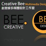
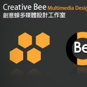
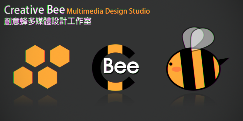
這是於2010年時為「創意蜂」多媒體設計工作室所設計的商標。
有設計了多組的商標,而這是其中三個。
主體的顏色是蜂蜜黃,搭配蜜蜂的元素去設計。
第一個是簡單風格的蜂巢狀網格。
第二個是以創意的字首C跟蜜蜂的Bee去做結合。
第三個是走可愛的風格,蜜蜂的樣子像是一個對話框。
Creative Bee Studio | Logo Design 1
This is a logo designed for the "creative bee" multimedia design studio in 2010.
There are multiple sets of logos designed, and this is three of them.
The color of the main body is honey yellow, designed with elements of bees.
The first is a simple style honeycomb grid.
The second is to combine the creative prefix C with the Bee.
The third is a cute style, the bee looks like a dialog box.
NFT連結 | NFT Link